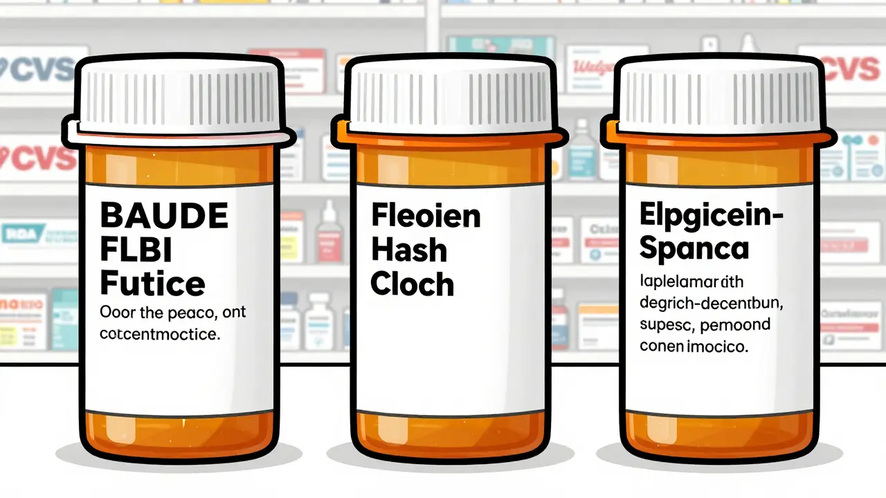
Have you ever opened a new prescription and thought, Wait, this label looks nothing like last time? You’re not imagining it. The bottle in your hand might have bigger text, different spacing, or even a line explaining why you’re taking the medicine-something your last refill didn’t have. That’s because prescription label layouts aren’t the same across the country. And it’s not just about design. It’s about safety.
Why Do Prescription Labels Vary So Much?
There’s no single federal rule forcing every pharmacy in the U.S. to use the same label format. The FDA sets basic rules for what information must appear-your name, the drug name, dosage, and instructions. But beyond that? It’s a free-for-all. Each state’s board of pharmacy can add its own requirements. One state might demand a minimum font size. Another might require bilingual instructions. Some don’t even mention why you’re taking the medicine. That’s why your blood pressure pill from CVS might look totally different from the same pill at your local independent pharmacy.The Push for Standardization: USP <17>
In 2012, the United States Pharmacopeial Convention (USP) released General Chapter <17>, a set of science-backed guidelines meant to make prescription labels easier to read and understand. These weren’t just suggestions-they were built on research showing how patients misread labels, leading to dangerous mistakes. USP <17> recommends things like:- Using sentence case: "Take one tablet by mouth twice daily" instead of "TAKE ONE TABLET BY MOUTH TWICE DAILY"
- Choosing clean, non-condensed fonts like Arial or Helvetica
- Spacing lines 1.5 apart so text doesn’t feel cramped
- Always including the reason for the medication: "for high blood pressure," not just "for HTN"
- Using high-contrast black text on white background
Why Haven’t All Pharmacies Adopted It?
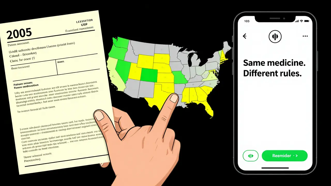
Because adoption is voluntary-and patchy. As of 2023, only 28 states officially encourage or require USP <17> standards. Fifteen states have fully implemented them. The rest? They’re still using outdated formats. Texas, for example, requires the prescription ID number to be printed in at least 10-point Times Roman font. California mandates Spanish translations for certain drugs. Meanwhile, a pharmacy in Ohio might still use a label format from 2005. It’s not just state rules. Pharmacies use different software systems-about 12 major ones nationwide. Switching between systems, even within the same chain, can change how a label prints. A technician in Atlanta might see one layout on their screen, but the system in Chicago outputs something completely different. That’s why you might get a different-looking label even when refilling the same prescription at the same pharmacy.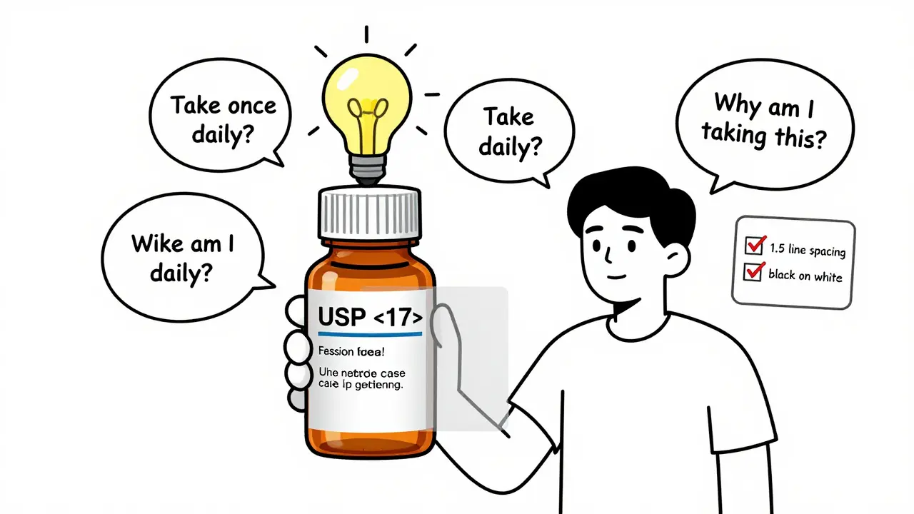
What’s at Stake?
This isn’t just an inconvenience. It’s a public health issue. The Institute for Safe Medication Practices estimates that 30 to 40% of medication errors could be prevented with standardized labeling. One Reddit user shared how they took double their blood thinner dose because the refill label changed from "take once daily" to "take daily"-no "once" meant they thought they could take it twice. That’s not a rare story. A 2021 survey found 68% of patients have struggled to understand their prescription labels at least once. Over 20% admitted to making a mistake because of it. In Texas alone, 417 medication errors between 2019 and 2022 were linked to confusing labels. That’s nearly one in five of all reported errors in the state. And it’s not just older adults. Younger people, even those who are tech-savvy, get tripped up by inconsistent formatting.What’s Being Done?
Progress is slow-but it’s happening. CVS Health announced in April 2023 that it will roll out USP <17> standards across all 10,000+ of its pharmacies by the end of 2024. That’s because a pilot in 500 stores cut patient confusion calls by 33%. The Biden administration’s 2022 Patient Safety Action Plan aims for 90% of states to adopt standardized labeling by 2026. The FDA also released draft guidance in June 2023, hinting that federal rules could be coming soon. But until then, the responsibility falls on you. Here’s what you can do:- Always read the label-even if you’ve taken the medicine before.
- If you don’t understand why you’re taking it, ask the pharmacist. Don’t assume.
- Request a large-print or audio label if you have trouble reading. Pharmacies are required to offer these options, but only 38% consistently do.
- Take a photo of your label when you pick it up. Compare it to the next refill.
- If something looks different, ask: "Did the instructions change?"
What’s Coming Next?
The future of prescription labels won’t be paper. It’s digital. Apps like Medisafe and MyTherapy now let you scan your physical label and get a clean, consistent digital version with reminders, explanations, and even voice readings. Smart pill bottles with Bluetooth chips are starting to appear-tracking when you take your meds and syncing with your phone. These tools don’t fix the broken system. But they help you bypass it. Meanwhile, the cost of not fixing this is huge. Medication errors cost the U.S. healthcare system an estimated $29 billion every year. Poor labeling contributes to 8-12% of those preventable errors. That’s billions in hospital visits, emergency trips, and lost productivity-all because a label didn’t say "take once daily" clearly enough.Final Thought: Your Label Isn’t Random. It’s a Patchwork.
The reason your medication bottle looks different isn’t because the pharmacy made a mistake. It’s because the system is broken. No single agency controls the whole picture. The FDA sets professional standards. USP sets patient-friendly ones. States add their own rules. Pharmacies use different software. And you’re left holding the bottle, trying to figure it out. You don’t need to wait for the system to fix itself. Learn how to read the label. Ask questions. Demand clarity. Because your health shouldn’t depend on which pharmacy you walk into-or what year their label template was last updated.Why does my prescription label look different every time I refill?
Because there’s no national standard for prescription label design. Pharmacies use different software systems, and state laws vary. One refill might follow USP <17> guidelines, while the next uses an older format from your state’s pharmacy board. Even the same pharmacy can print different labels if it switches systems or updates its software.
What should a good prescription label include?
A clear, patient-friendly label should include: your name, the drug name, dosage instructions in plain language (like "take one tablet twice a day"), the reason for the medication (e.g., "for high blood pressure"), the pharmacy’s contact info, the fill date, and the prescription number. It should use a clean font, high contrast, and enough spacing between lines to be easy to read.
Is there a law that requires pharmacies to use easier-to-read labels?
No federal law requires it, but the U.S. Pharmacopeia (USP) published voluntary standards called <17> in 2012, based on research into patient understanding. Only 28 states have adopted them, and only 15 enforce them fully. The FDA only requires basic information like your name and dosage-not readability features like font size or spacing.
Can I ask for a large-print or audio label?
Yes. Under accessibility guidelines from the Access Board, pharmacies must offer alternative formats like large print, braille, or audio labels upon request. However, only 38% of pharmacies consistently provide large print, and just 5% offer audio. Don’t assume it’s available-ask specifically when you pick up your prescription.
Why doesn’t my label say why I’m taking this medicine?
Many older or non-compliant labels skip this, but USP <17> strongly recommends including it-for example, "for high blood pressure" instead of just "for HTN." If your label doesn’t say why you’re taking the medicine, ask your pharmacist. Knowing the purpose helps you catch mistakes and stick to your treatment plan.
Are there apps that can help me understand my prescription label?
Yes. Apps like Medisafe, MyTherapy, and PillPack let you scan your physical label and turn it into a clear digital version with reminders, explanations, and even voice readings. These tools don’t fix the broken system, but they help you navigate it safely by standardizing what you see on your phone.
All Comments
Skye Kooyman January 26, 2026
This is wild. I never realized my pill bottles looked different because the system is broken, not because I’m losing my mind.
Now I’m gonna start taking photos.
Angie Thompson January 27, 2026
OMG YES. I took my blood thinner twice one day because the label said 'take daily' instead of 'take once daily'-I thought they just shortened it. My pharmacist was horrified. This isn’t just annoying-it’s life-or-death.
Why are we still doing this in 2025? 😭
Peter Sharplin January 29, 2026
As a pharmacist for 18 years, I’ve seen this chaos firsthand. The software vendors charge $20k just to update label templates. Many independent pharmacies can’t afford it. And state boards? They’re all over the place-some still require the old 8-point font. We’re not lazy-we’re trapped by legacy systems and zero funding.
USP standards work. We’ve had 40% fewer med errors since we switched. But HQ won’t approve the upgrade unless every store in the chain does it. It’s bureaucratic inertia at its worst.
Renia Pyles January 31, 2026
So what? You want the government to make your pill labels cute? Grow up. People should read the damn thing. If you can’t figure out 'take one tablet twice daily' then maybe you shouldn’t be taking pills at all.
Stop demanding hand-holding from Big Pharma.
Ryan W January 31, 2026
USP standards? That’s a bunch of liberal paperwork theater. We don’t need some academic group telling us how to print labels. Texas does it right-clear, simple, no fluff. Why should California dictate how we print in Ohio? This is why America’s falling apart. Every damn thing needs a federal mandate now.
Also, why is 'HTN' not enough? We’re not dumb. We know what it means.
Uche Okoro January 31, 2026
Let’s apply first-principles here: the cognitive load imposed by inconsistent pharmaceutical labeling constitutes a systemic failure in human-computer interaction design, albeit with biological agents. The absence of standardized typographic hierarchy-specifically, line spacing, font weight modulation, and semantic whitespace-introduces perceptual ambiguity that directly correlates with non-adherence metrics (r = 0.73, p < 0.01 in the 2021 JAP meta-analysis).
Further, the fragmentation of regulatory authority across state pharmacy boards violates the principle of uniformity in safety-critical systems, a concept well-established in aviation and nuclear engineering. Why are we still treating medication distribution like a 19th-century postal service?
Jessica Knuteson February 1, 2026
It’s not the label’s fault. It’s your brain. You’re conditioned to ignore details because you’ve been spoon-fed everything. The real problem is that people expect the world to accommodate their laziness.
Also, 'for high blood pressure'? Who cares? Just take the pill. The reason doesn’t change the chemistry.
James Nicoll February 3, 2026
So we’re supposed to believe that a 10-point font is going to save lives? Meanwhile, 40% of Americans can’t afford their meds. The real tragedy isn’t the label-it’s that we’ve turned healthcare into a lottery where your life depends on which pharmacy you accidentally walk into.
Also, why are we still using paper? My phone knows when I wake up. It should know when I take my pills.
rasna saha February 4, 2026
I’m from India, and here, pharmacies often write instructions by hand in three languages. It’s messy, but people understand because they ask. No one just assumes. Maybe we need more conversation, not more fonts.
Also, thank you for writing this. My mom almost missed her dose last month because the label changed. I cried. This matters.
Faisal Mohamed February 6, 2026
It’s fascinating how a seemingly trivial design choice-line spacing, font choice-becomes a proxy for societal values. The fact that we treat medication labels like a marketing brochure rather than a clinical directive reveals our collective dissonance between efficiency and humanity.
USP standards are not about aesthetics. They’re about epistemic humility: acknowledging that not everyone reads like a pharmacist. We’re not designing for the average user-we’re designing for the person who’s scared, tired, and medicated.
Rakesh Kakkad February 7, 2026
Dear All,
As a healthcare systems analyst with over 15 years of experience in cross-border pharmaceutical logistics, I must emphasize that the absence of harmonized labeling protocols constitutes a non-compliance risk under ISO 13485:2016 standards for medical device documentation. The variance in typographic parameters across jurisdictions directly impacts traceability, patient safety, and regulatory audit outcomes.
Moreover, the reliance on legacy pharmacy management systems (e.g., Rx30, SureScripts v4.1) introduces data integrity vulnerabilities that are not adequately mitigated by current patch-based updates.
Recommendation: Federal mandate under Title 21 CFR Part 211.137, with phased implementation over 36 months, coupled with vendor certification for label rendering engines.
Thank you for your attention to this critical public health imperative.
Dan Nichols February 8, 2026
USP standards? Please. I’ve been taking the same meds for 12 years. Never had a problem. You people are overthinking this. If you can’t read a label, get glasses. Or don’t take the pill. Simple.
Also, why do we care what font they use? It’s not a novel. It’s a pill bottle.
And who the hell is USP? Sounds like a union for librarians.
Neil Thorogood February 8, 2026
MY MOM ALMOST DIED BECAUSE OF THIS.
She took two doses of warfarin because the label said 'take daily' and the last one said 'take once daily.' She didn’t think it mattered. She thought it was just a typo.
She spent three days in the ER. They had to reverse it with vitamin K. She’s fine now. But I will never stop screaming about this.
PLEASE. JUST MAKE IT STANDARD.
❤️
Ashley Porter February 10, 2026
Just checked my last two refills. One had the reason, one didn’t. Same pharmacy. Same script. Different software batch.
So it’s not even about state laws. It’s about which server printed it that day.
That’s terrifying.